I tried my best English here, so please hold out with me

Here it is!
...
Note: this tutorial is targeted for skinners with high performing machines (or computers that take the sims easily and have good graphics)
Do you struggle with taking snapshots for your website or can never get your model to look his or her best? Here are some tips and a reference for your pleasure.
Before we begin, let's make sure to assemble some things. We will probably need (is not required, just highly recommended):
-Murano's Reflective Floors (can aquire for free at PMBD)
-Decorgal's Model Pose Hack (get it! Well worth the MB's in your downloads folder!)
-Shaklin's Model Walk Hack object (This I personally use frequently but depends on what kind of snapshot you want. Get it at Sims2 Graveyard)
-University or Bon Voyage EP (comes with the Pose addition)
-Assorted custom hairs, makeups and skintones
Once you have gotten all this, we'll begin. Remember, all those things are not required but very highly recommended.
Okay, let's begin...
1) Your Model
First, we need a model. There are tons of models around for download. I especially recommend Sera's models (Sims2Graveyard) and Jirka's models. You can also make your own model. Whatever you choose, be creative. NEVER EVER just choose the first default face and call it a day! Do you want a high fashion model? Then hallowing the cheeks, widening the jaw and upping the brows work well. Want an alternative fashion model (alternative fashion is American Eagle, Hollister, Forever 21, Hot Topic, American Apparel, etc.)? Then a cute face with big eyes, slanted brows and a big smile works fabulously. Whatever you wish, think about what will look good on your site. I highly recommend using a custom skintone because the Maxis ones are very plain and look bad in light (which we will be using excessively).
2) Your Game Settings
After you finish your model (make her in Bodyshop) and assuming you've made your custom clothing, open up the game. We're going to adjust some game settings to make your snapshots sparkle.
- Go into Graphic Performance. Shadows OFF - Sim Detail HIGH - Reflections ON - Graphics HIGH -
- Go into Settings. Free Will OFF - Object Hiding OFF
These settings are constant. They produce the best snapshots.
3) Your Studio
A nice thing to have is a studio. A nice big lot for your sims. Here's my personal one that I use for all the screenshots:
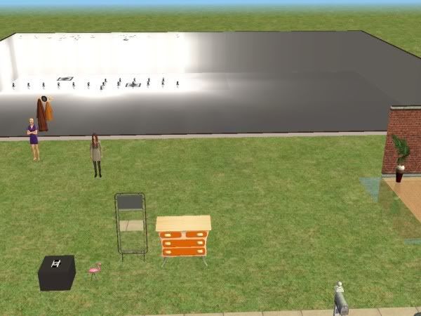
As you can see, I have my dresser, my mirror for changing appearance, my sets and my hacks.
4) Type of Snapshot
There are three types of snapshots: catwalk, alternative, and Maxis pose.
Catwalk snapshots are snapshots of your model walking. This is where Shaklin's model hack comes in. It primarily looks like this:
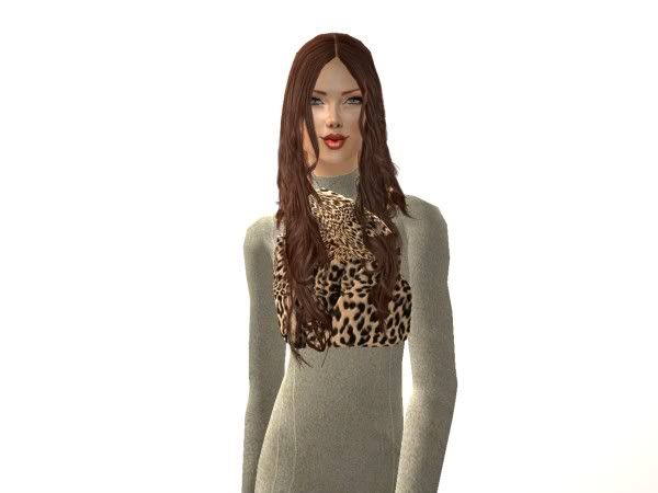
Sites like my site, La Jeunesse, Glamorous Lounge and Siluetta use this.
Then there are Alternative snapshots. These use Decorgal's model pose hack. This is where you have a decorated set and your model is posing. It looks like this:
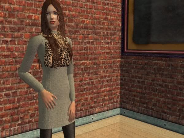
Sites like Vanilla Femme and Poison Pink Lemons use this.
Last and not least is the Maxis Poses snapshot. This is where your sims are using Maxis created poses that come with the game to pose in a blank scenery. They look like this:
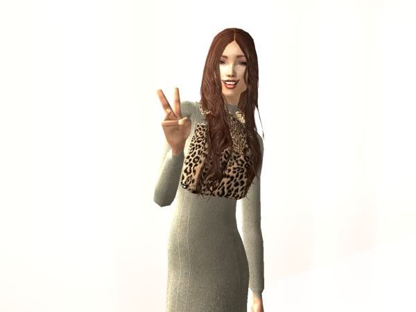
Sites like Inlimite and Boolprop Sims use this.
So whatever you choose, think about what would look great on your site, what is in your editing grasp, and what makes the clothes look great.
The set is also important.
5) Sets and Lighting
Lighting is your biggest benefit or hinderance. The correct lighting makes a perfect snapshot or can make your model look stupid. The set is equally important: it's what your model is posing/walking in. Here is a Catwalk/Maxis Pose set and what the lighting setup might look like:
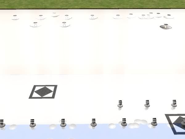
As you can see, lights are clustered everywhere and the whole thing is blank.
Here is a Alternative/Decorgal Pose set. It has natural lighting and is usually a mockup, not a real building:
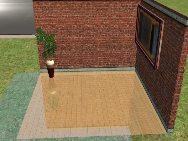
There is furniture but the room is scarce. There is a magazine advertisement feel to it and looks more expensive than it is.
There are also lighting choices once the set is made. Do you want your sim to be in an abundance of light or be in the dark. More light tends to look better because you can pbviously see more but some prefer no light. You compare.
Light:

Little Light:
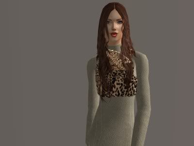
It's up to you but keep in mind that Little light snapshots dont look as good on weblayouts as Abundance of Light snapshots do.
6) Position Yourself!
Lastly, position your shot. Never have this happen:
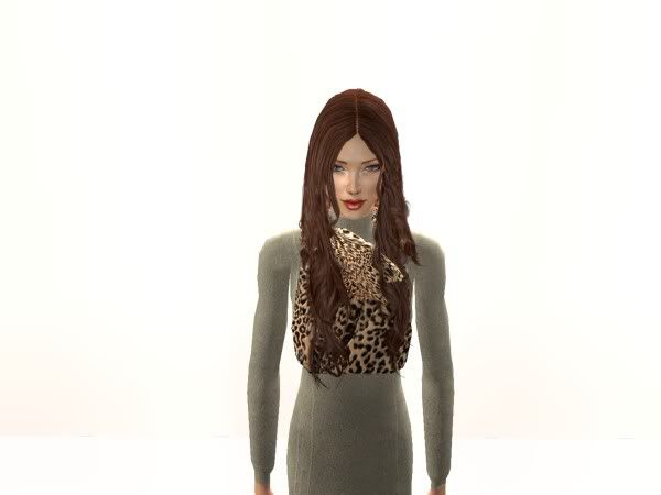
Always this: face forward, body forward or angled, everything visible:

CONCLUSION:
well that's all it takes! This is a beginner's tutorial and there's a few more elements involved if you want to be a pro (editing the snapshots, framing them, coding, etc.). But this should be sufficient for now!
Enjoy!
Donna
www.donnamoda.wickedsims.com